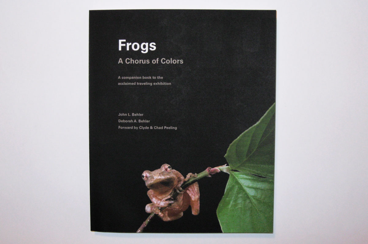
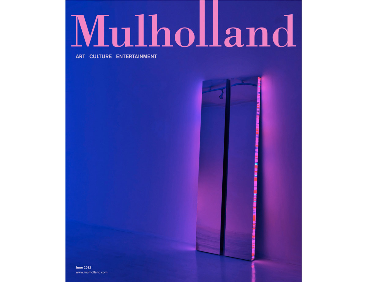
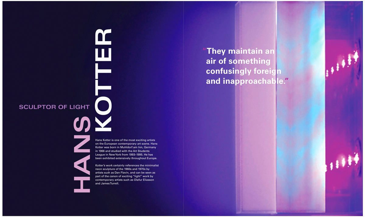
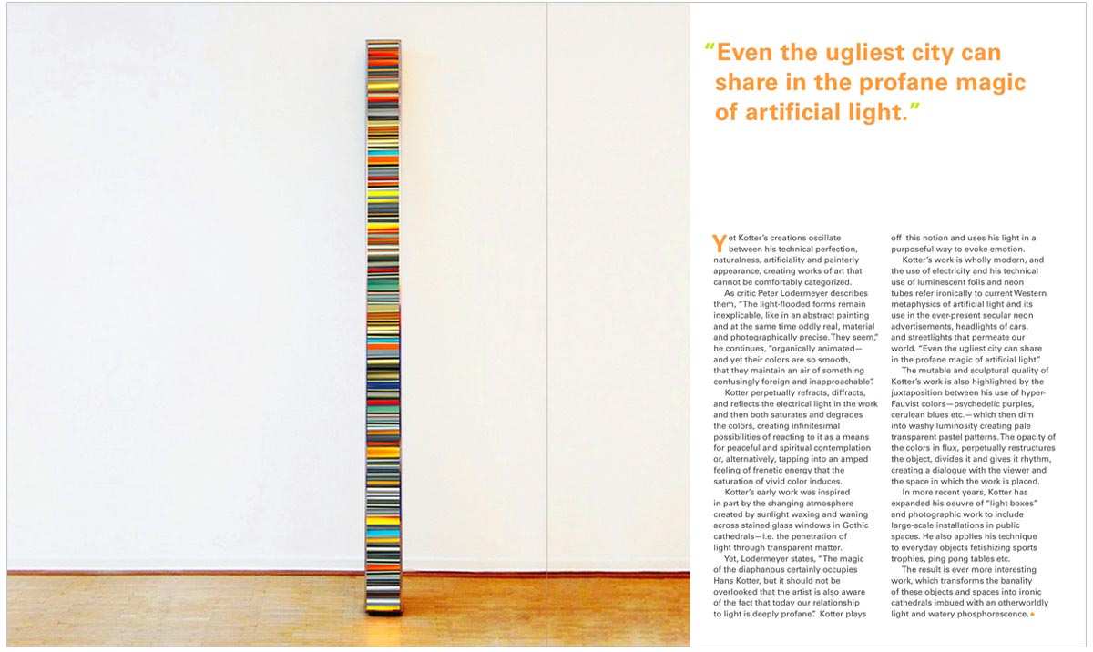
Layout work is one of the most painstaking tasks: it requires attention to every page, style, and word, from the front cover to glossary at the back. Being obsessed with details, its also something I love. Mulholland is a fictional Arts & Entertainment magazine. I designed the logo to resemble the famous Mulholland Drive in CA, then selected and designed an article about the artist Hans Kotter, who creates beautiful and alluring light sculptures.
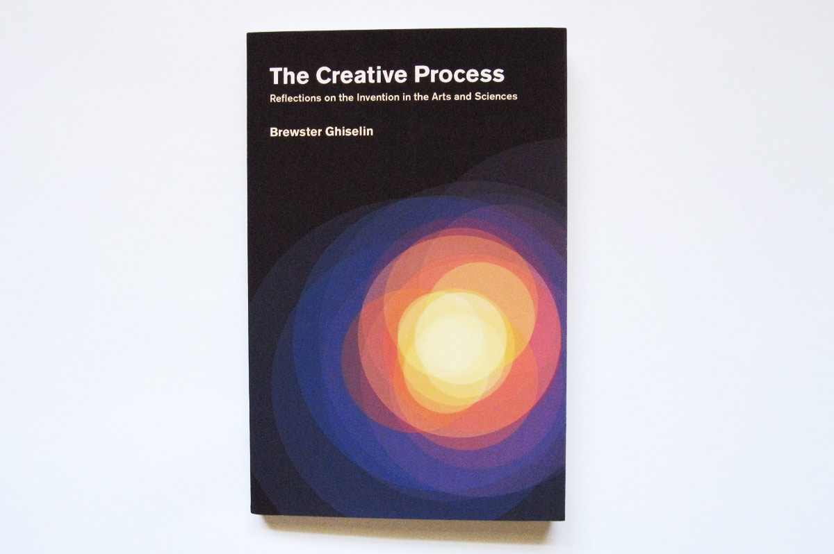
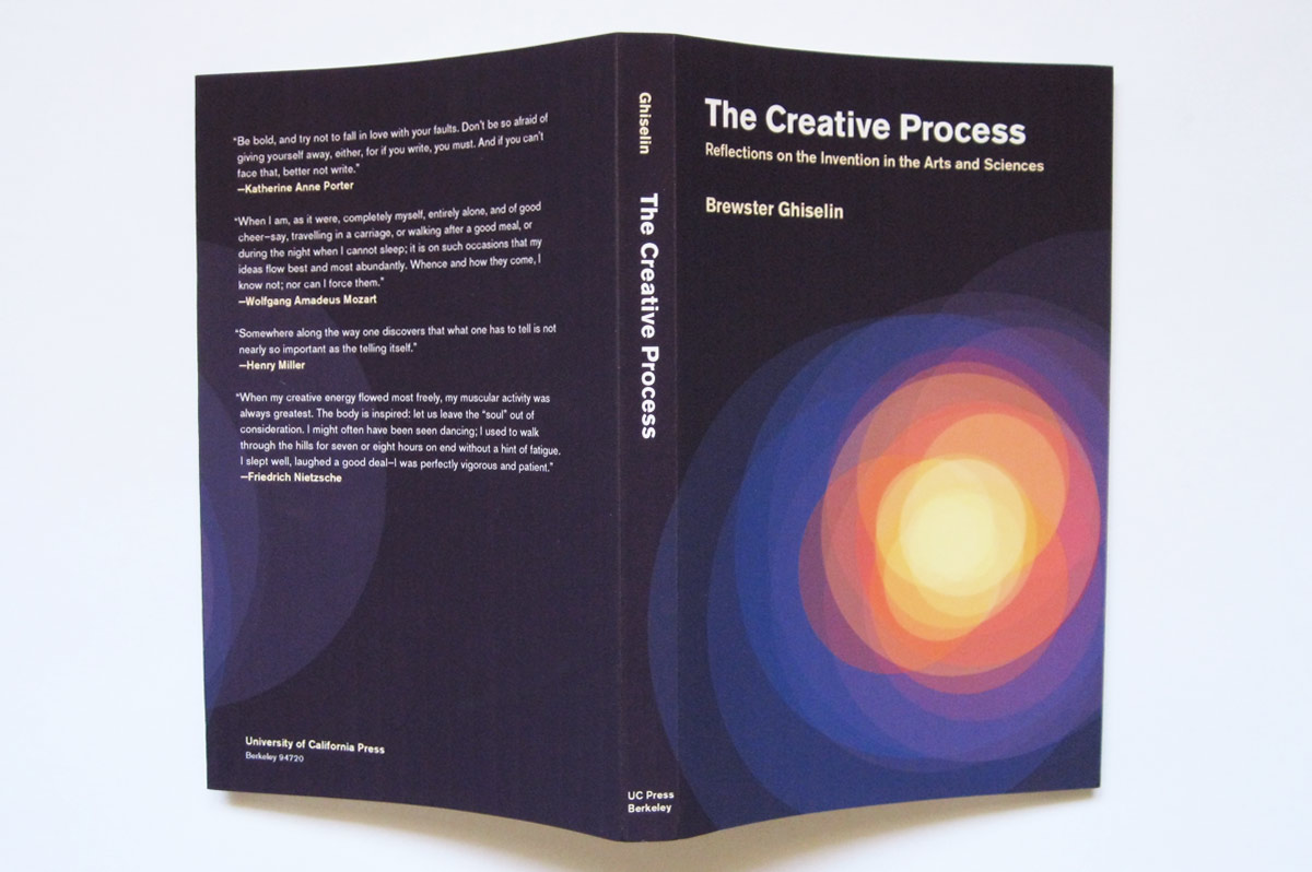
"The Creative Process" by Brewster Ghiselin is a collection of essays from writers, artists, and scientists who try to describe what the creative process is to them. However, the printed book also has a hideous cover. I redesigned the front & back covers of the book to be more fitting with the theme: the overlap and mingling of ideas, thoughts and theories that inform and forge the end product as the process unravels.
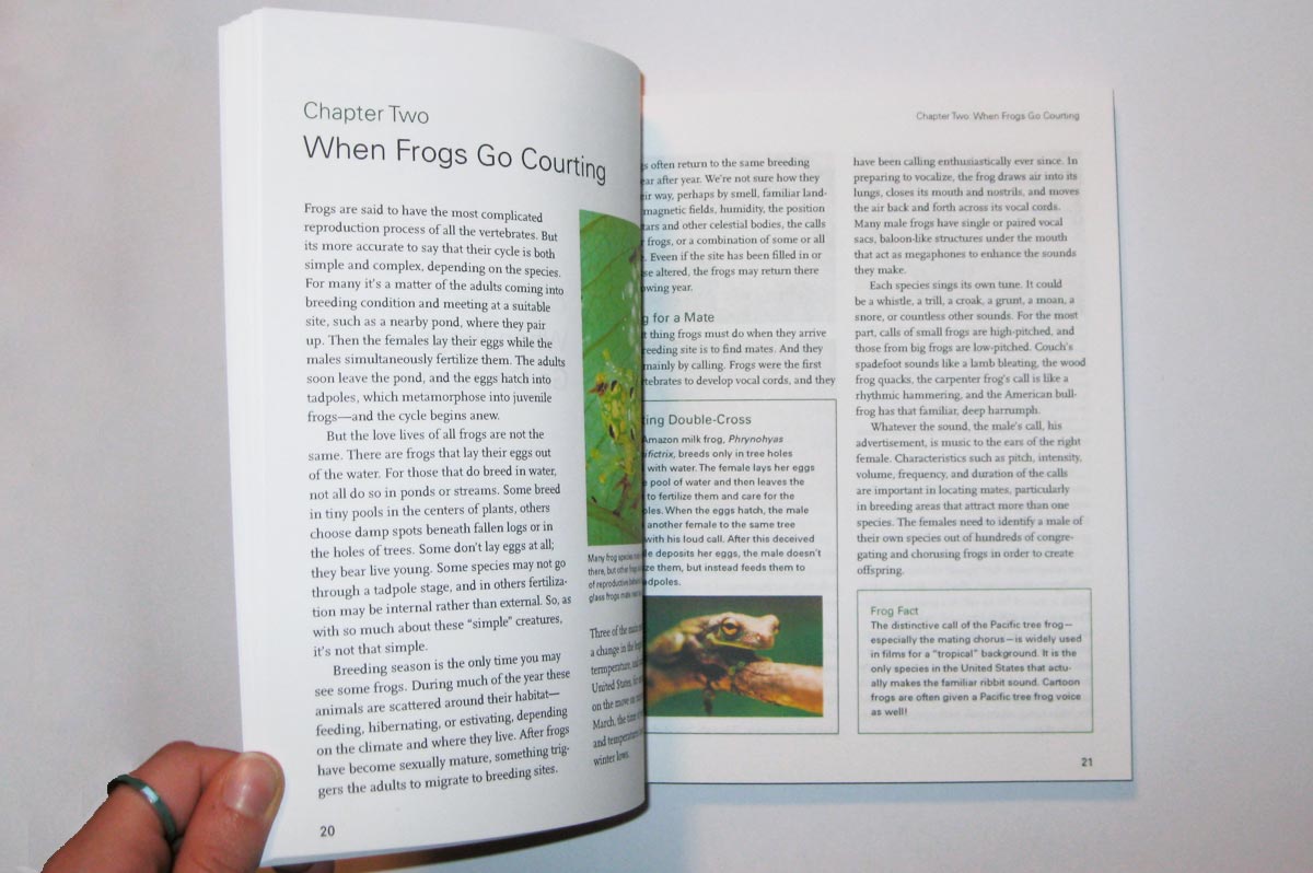
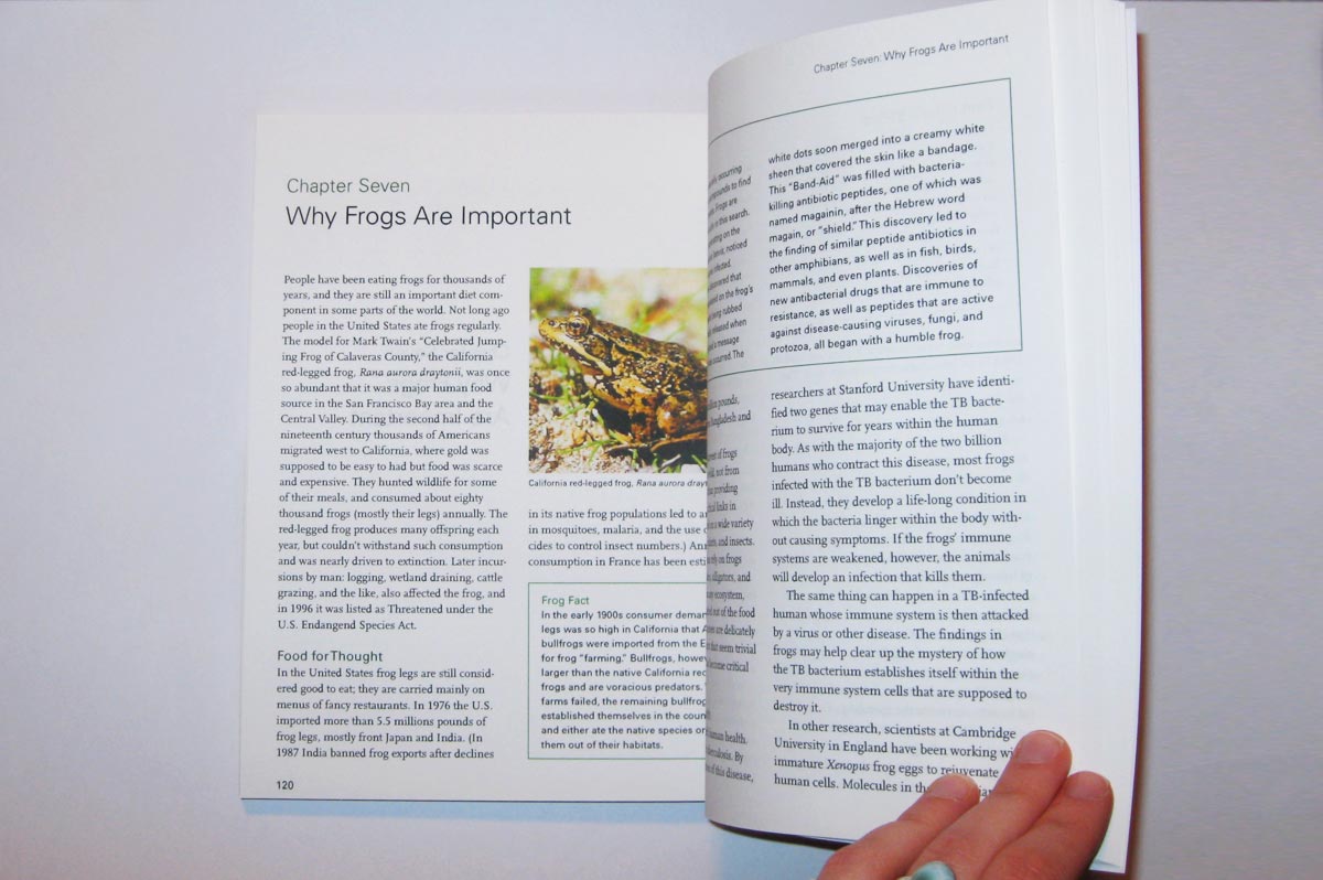
One of my favorite things to do is to find ugly design and reinvent it to make it better. I found "Frogs: A Chorus of Colors" at the library, and spent countless hours structuring, laying out pages, typesetting, and test printing. I completely redesigned the book, from the title and copyright pages, to the glossary at the back.
